Design Systems & Organisation
Design Systems
& Organisation
Design Systems & Organisation
Analysing the creation and maintenance of a my design process and design system
Analysing the creation and maintenance of a my design process and design system
Analysing the creation and maintenance of a my design process and design system


The Structure
The Structure
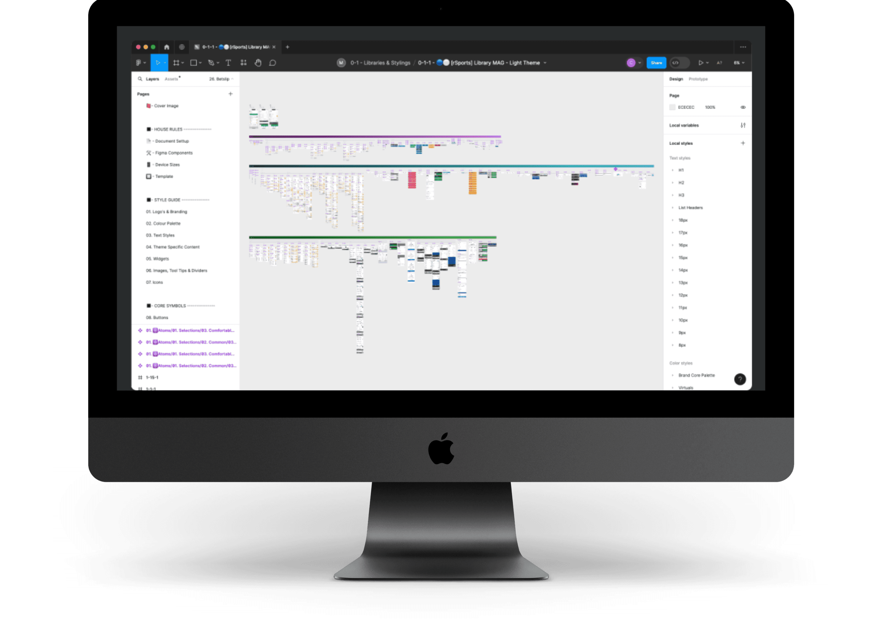
One of my strongest skillsets is the ability to build and continuously maintain the organisation of a well established design systems.
By following consistent naming conventions of assets, strict positions and spacing of components, and a clear hierarchal structure of building transferable symbols, it enables the process to be easily followed.
I believe in maintaining an efficient work flow, allows for more creative freedom elsewhere, as well as ensuring that any progressive design changes can be easily amended.


File Navigation
File Navigation
I enjoy the control Figma allows you to provide Design System file structures, and consistent naming conventions which mean you are able set up multiple projects that follow the same layout.
Consistency through this process enables any member of the team, at any level, to dive into individual projects, find what they need efficiently and continue the design flow with minimal questions needing to be ask.
Style Guides
Style Guides
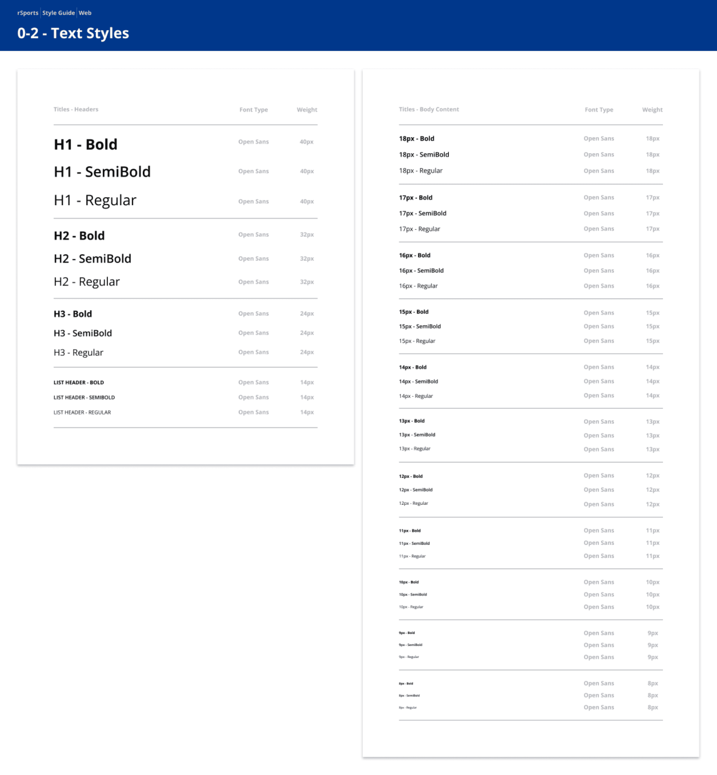
Clearly defined style guides for accurate handover to developers, ensuring each brand palette is clearly laid out and named correctly. This also allows for design flows to be easily switched out across the necessary themes.
Clearly defined style guides for accurate handover to developers, ensuring each brand palette is clearly laid out and named correctly. This also allows for design flows to be easily switched out across the necessary themes.


Switching Themes
Switching Themes
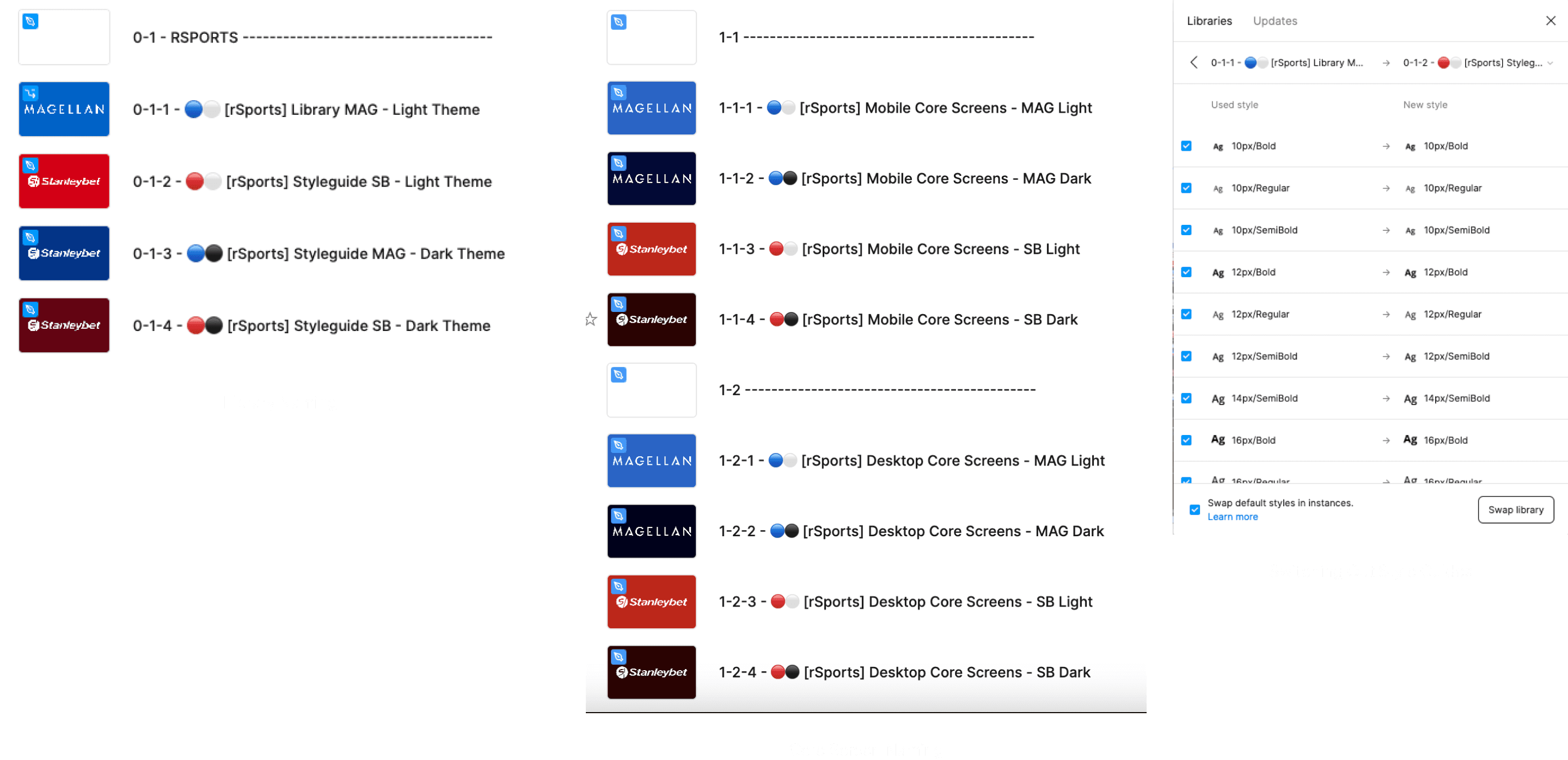
Dark mode is something that is growing in every industry, through benefits it has on the users eyes, as well as general preferred aesthetic and visuals. One of the big things I have enjoyed is the ability to switch themes/palettes and branding, and can do this at any stage of the design process.
Dark mode is something that is growing in every industry, through benefits it has on the users eyes, as well as general preferred aesthetic and visuals. One of the big things I have enjoyed is the ability to switch themes/palettes and branding, and can do this at any stage of the design process.


Library Component Structure
Library Component Structure


⚛️ ATOMS
⚛️ ATOMS
Atoms are reusable component assets that work across multiple Molecule structures, and can be utilised to switch out different core states. These could also be pieces of information that work across both Mobile & Desktop.
Atoms are reusable component assets that work across multiple Molecule structures, and can be utilised to switch out different core states. These could also be pieces of information that work across both Mobile & Desktop.


🧬 MOLECULES
🧬 MOLECULES
Molecules are the main display of certain components. This could be groups of Atoms, a collection of different points of information, and feature cards on how they are displayed to the user.
Molecules are the main display of certain components. This could be groups of Atoms, a collection of different points of information, and feature cards on how they are displayed to the user.
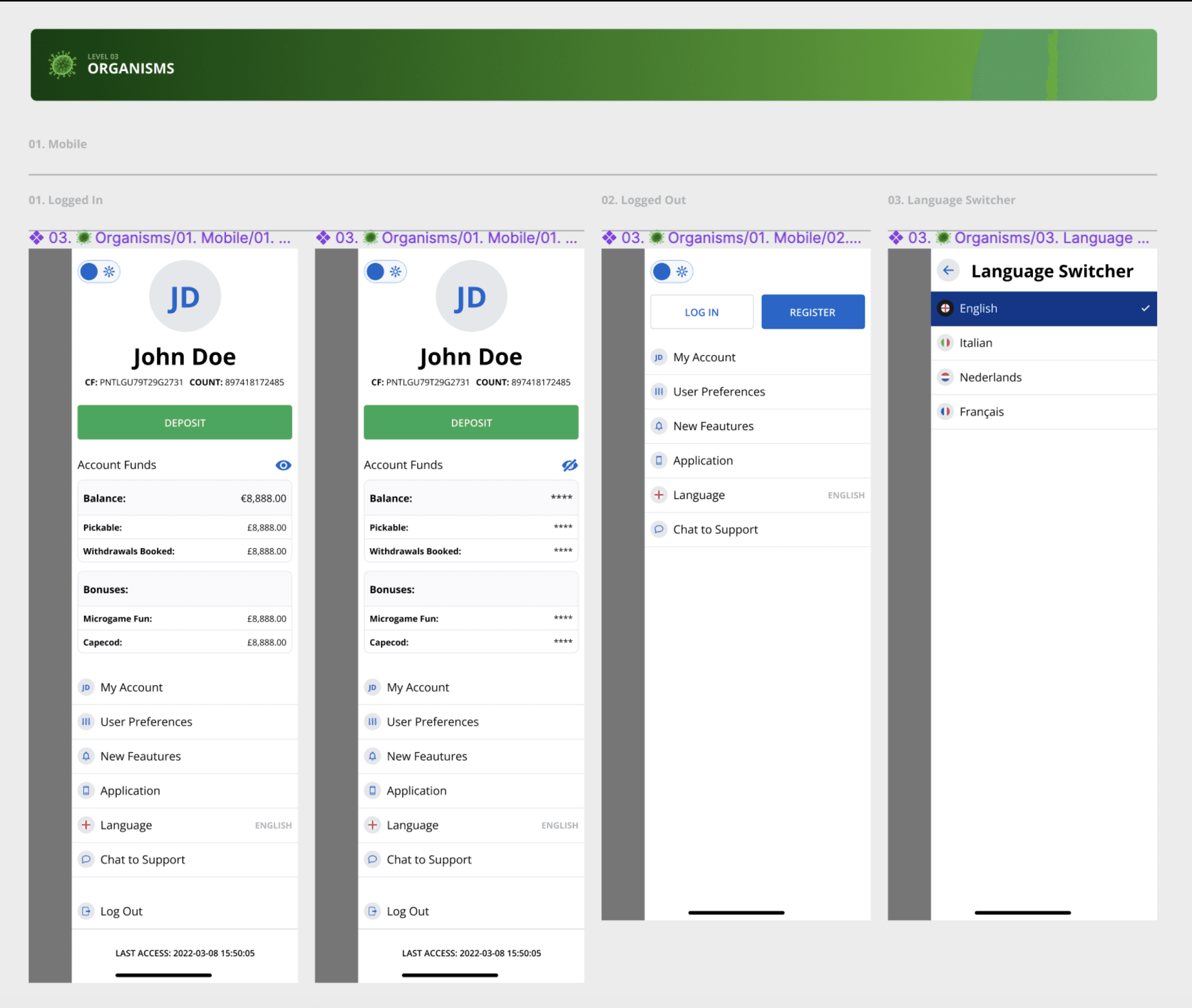


🦠 ORGANISMS
🦠 ORGANISMS
Organisms are a collection of Molecules, and how a set of data can be organised and on core screens. These may also show how the different states of single components may look as part of a group.
This layout is used to reduce the amount of single screens have to be updated during any feedback or feature request processes.
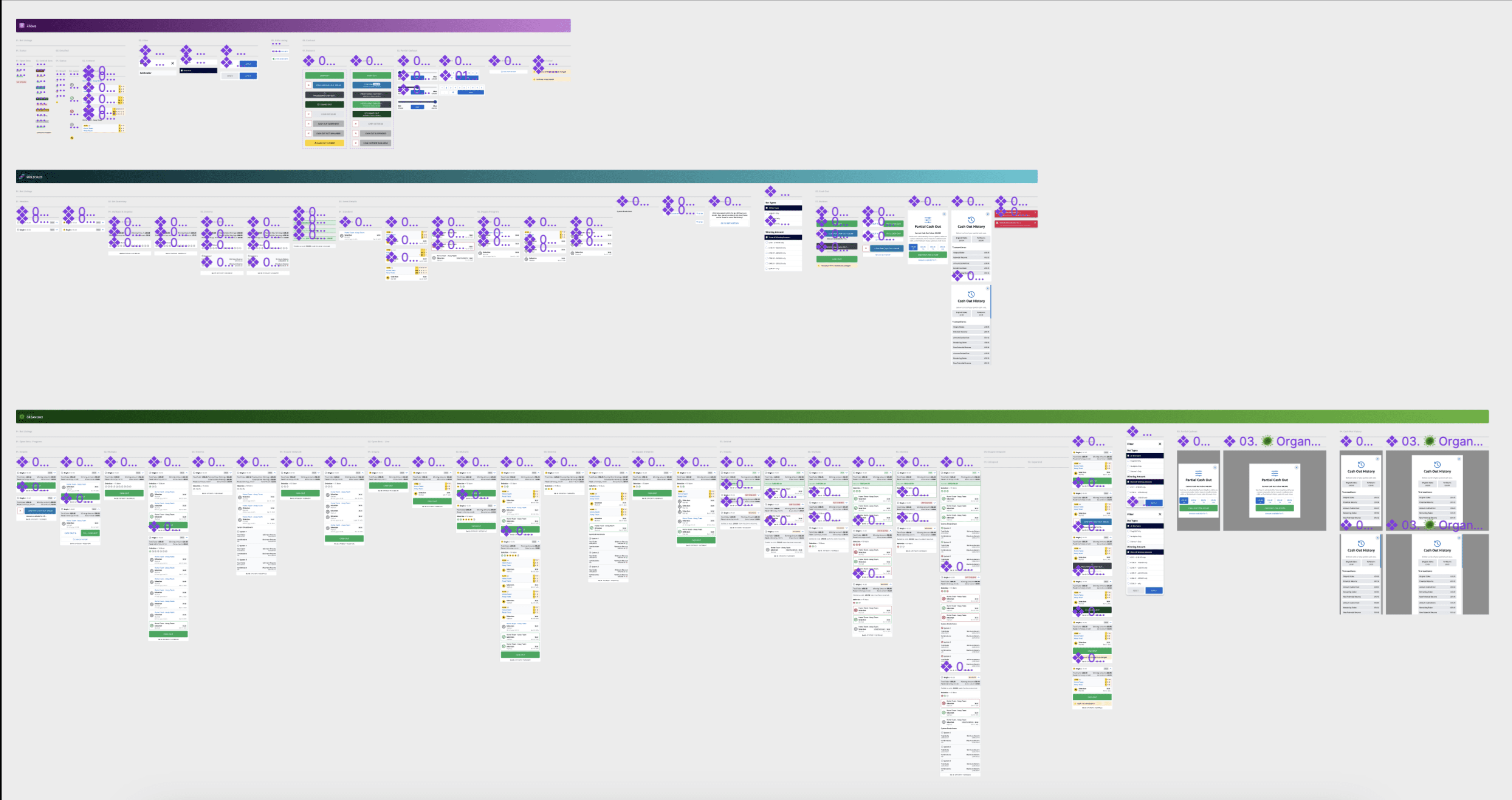


Component Structure on a Larger Scale
Component Structure on a Larger Scale
Core Screens
Core Screens
Keeping to rules where, pages/components sit at (0px, 0px) on the page position, keeping to padding and spacing even in the document stages. This ensures clean and well presented references to all designs, and colleagues can easily understand where the designs that they need are on each page.
Keeping to rules where, pages/components sit at (0px, 0px) on the page position, keeping to padding and spacing even in the document stages. This ensures clean and well presented references to all designs, and colleagues can easily understand where the designs that they need are on each page.
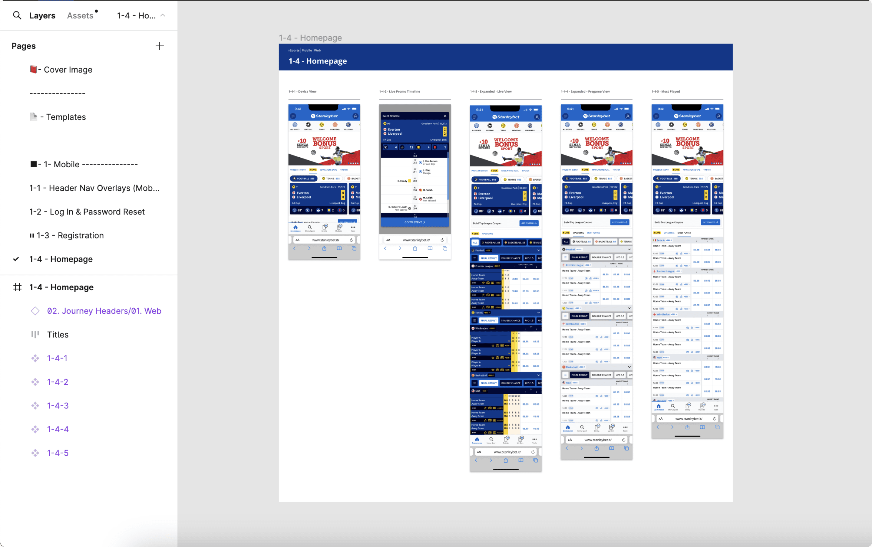


Document Layout In Use
Document Layout In Use
The Full Process
The Full Process
I believe there are 5 stages to a design process:
Idea Generation
This is carried out in an independant file, stripping and detaching current components, or even wireframing
Library & Symbol Set Up
This is where reusable assets and transferrable components live.
Core Screens
Hard references for each individual screen that references the whole product.
User Flow Handovers
Using tools such as Jira and Zeplin (and now exploring Figmas Dev Mode) means that specific user journeys are displayed, highlighting feature changes and new areas of focus are clear to the developers.
Prototyping and Mockups
This is utilised for showcasing touch points and understanding user flows through AB Testing.
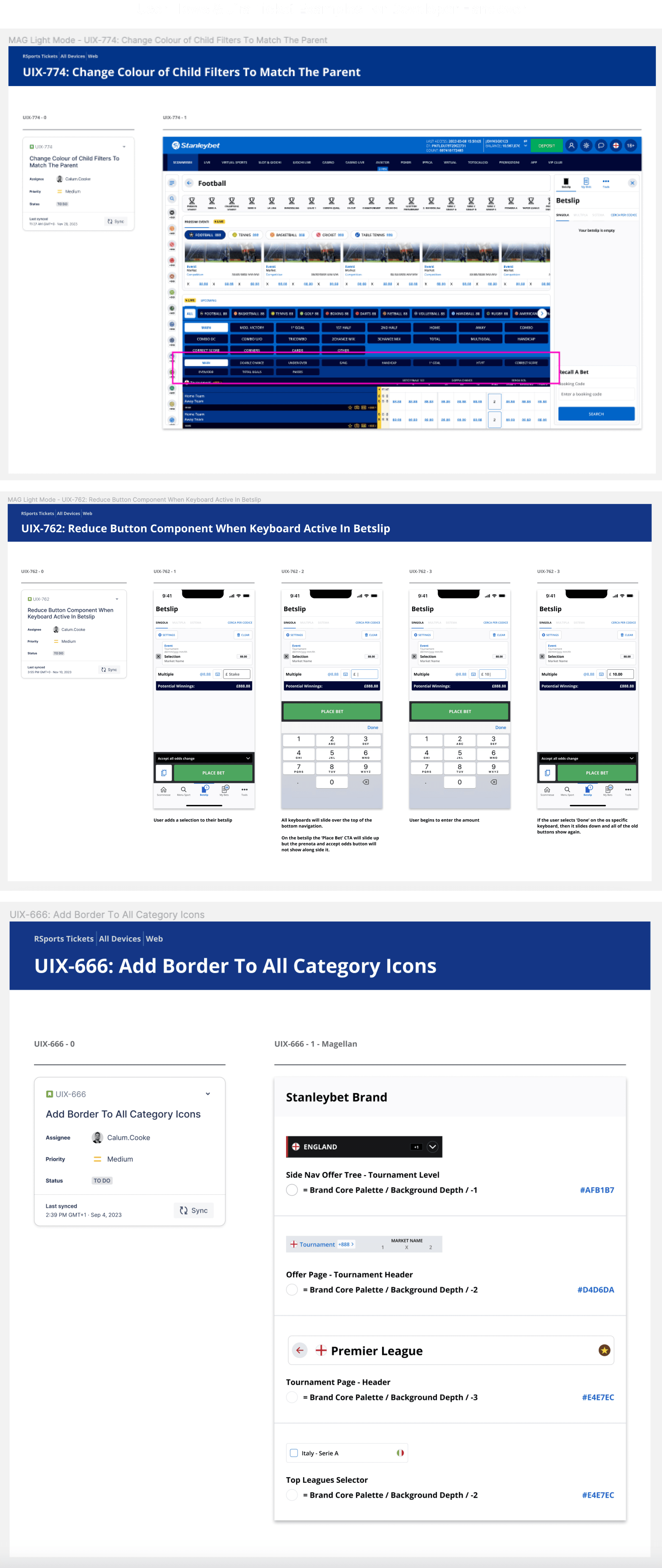


Prototyping & Mock Ups
Prototyping & Mock Ups
Prototyping flows are created to share with stakeholders, developers, product owners and also utilised for user testing.
Prototyping flows are created to share with stakeholders, developers, product owners and also utilised for user testing.


